Explore the new UI enhancements in ProjectionLab v3.3.0, including a streamlined mobile experience, refreshed Monte Carlo interface, and versatile withdrawal strategy modeling.
🎉 ProjectionLab v3.3.0 is here with some exciting new features! The first thing you’ll notice is the new UI. It’s been redesigned to work better on mobile, reduce clutter, and bring the key metrics into focus.
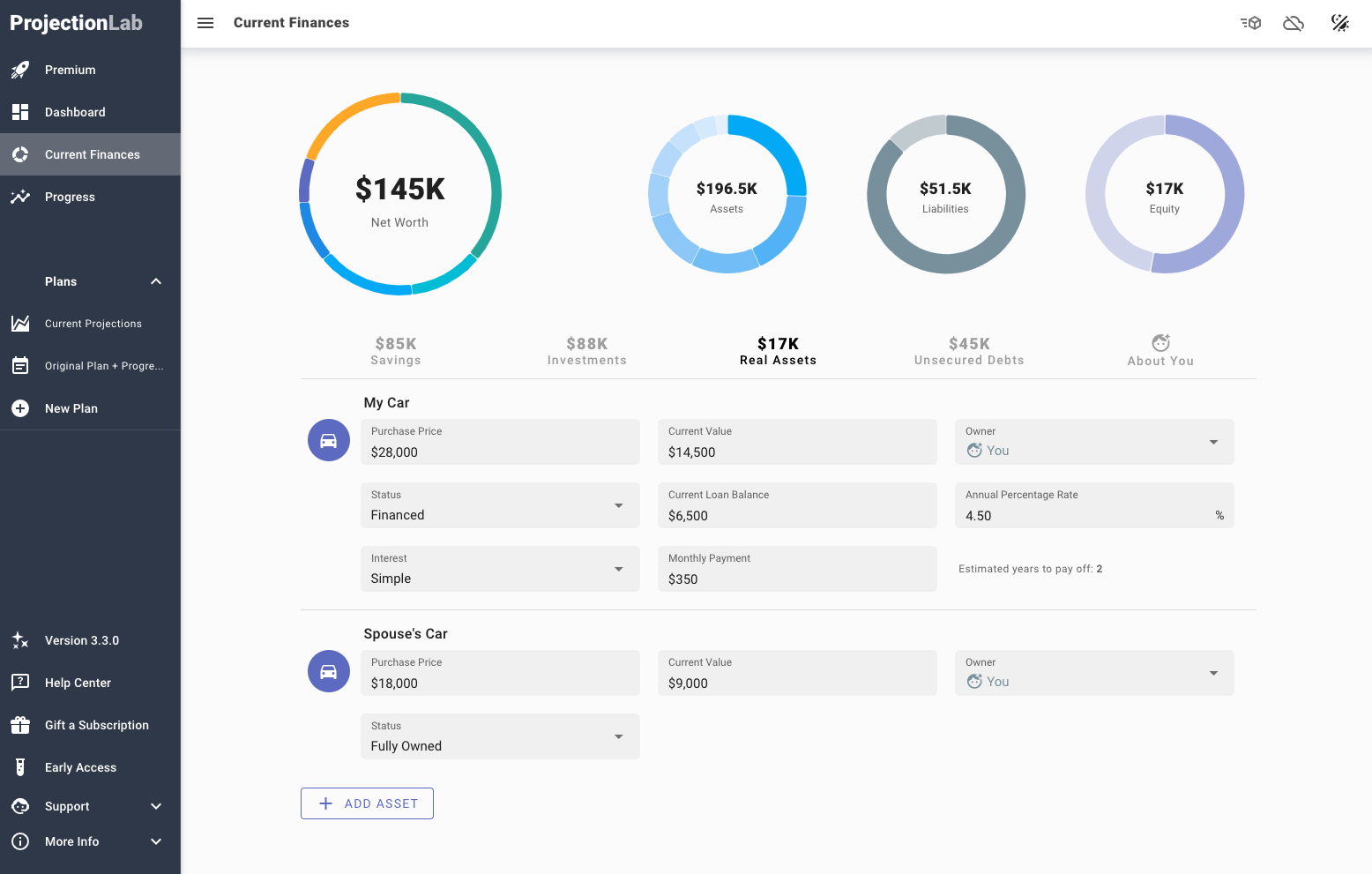
New Current Finances Screen
Here’s a look at the new Current Finances screen:

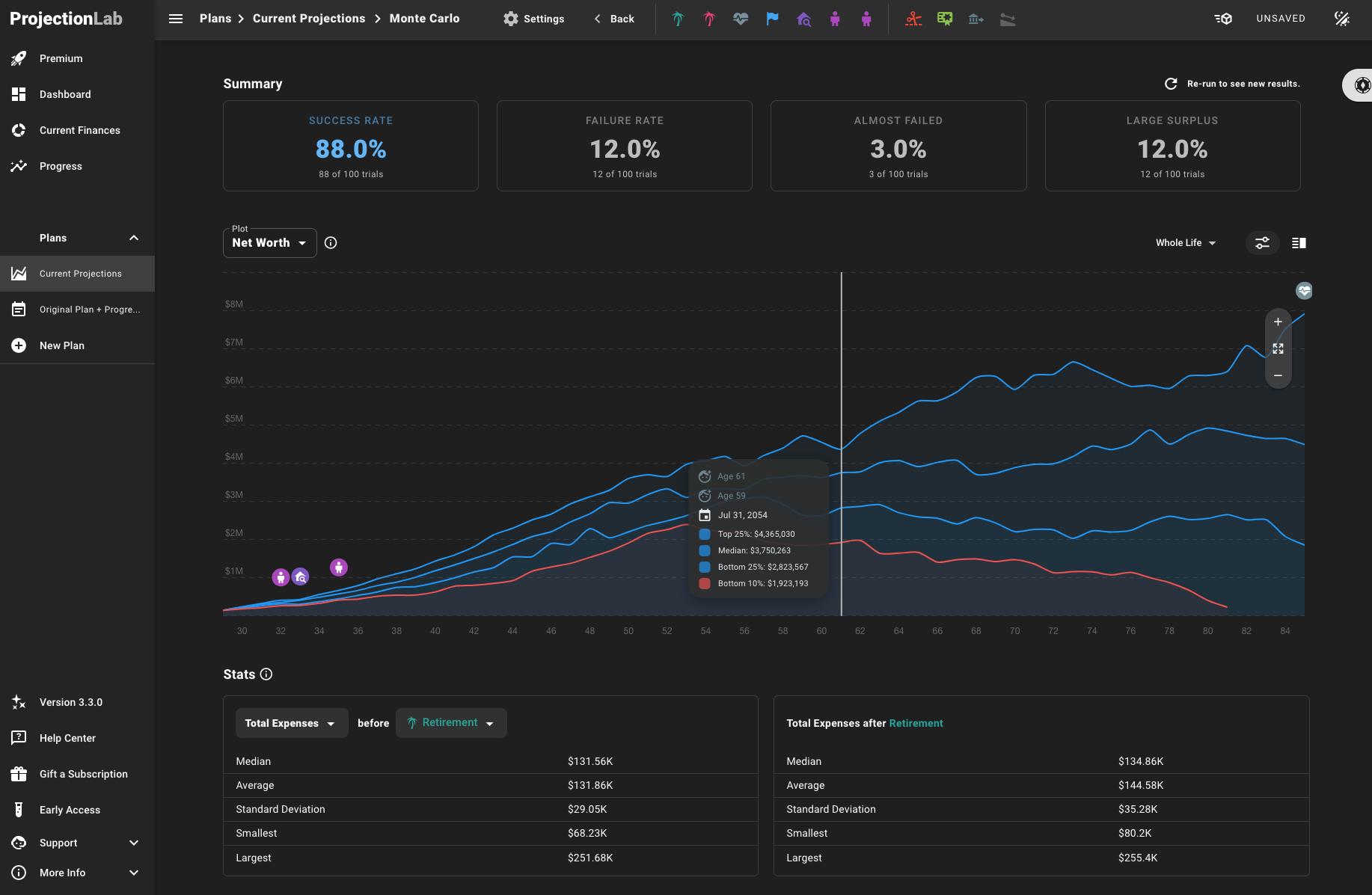
Refreshed Monte Carlo Interface
And here’s the refreshed Monte Carlo interface, where you can now customize which metrics to plot and stats to compute:

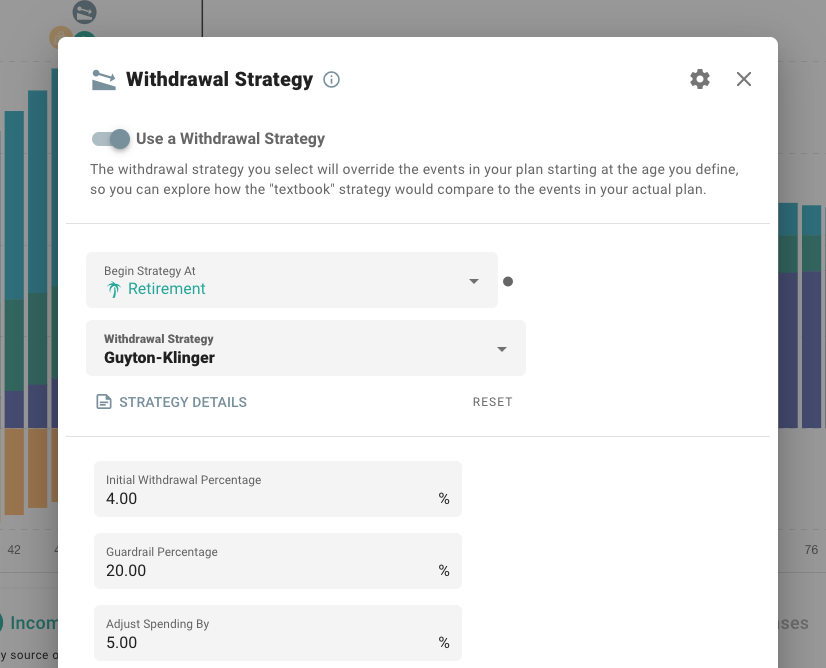
Modeling Different Withdrawal Strategies
Another highly requested feature was the ability to model different withdrawal strategies, so in v3.3.0 you can now explore a variety of classic methods from literature and the FI community (e.g. 4% rule, VPW, Ratcheting Safe Withdrawal Rate, etc.). This can help visualize what a more “textbook” approach might look like in comparison to the custom events in your ProjectionLab plan.

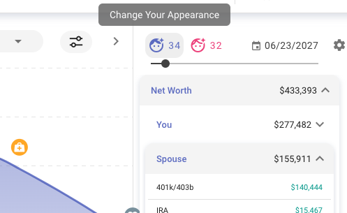
💑 Planning as a couple? Now there’s a separate tax filing mode for better international support, you can divvy up ownership of things in your plans, and you can customize names, icons, and colors.

🚀 And that’s not all. For more info on what’s new in v3.3.0, see the release notes.
🙏🏻 Thanks to everyone for your input, and let me know if you like the redesign and new features! As always, feel free to message me on Discord, Email, or Twitter.
Cheers,
Kyle